In the realm of data analytics, the clarity of communication is paramount. Power BI’s conditional formatting is a game-changer, providing visual cues that instantly convey the story behind the numbers. It’s not just about making reports look attractive; it’s about making them speak
What is Conditional Formatting in Power BI
Conditional formatting serves as a method to enhance the interpretability of visualizations by dynamically formatting data elements based on predefined rules. In Power BI, this functionality empowers users to create rules and apply formatting such as color changes, data bars, and icons to highlight significant data points within their reports.
Conditional formatting allows you to apply visual cues to your data based on its values. This can be anything from changing the background color of a table cell to highlighting bars in a chart or adding icons to a KPI card. By leveraging color and other visual elements, you can instantly draw attention to important information and guide viewers through your data story. This dynamic approach means your visuals reflect the underlying data reality, making it easier to spot trends, outliers, and critical insights at a glance.
Let’s delve into how conditional formatting can be your ally in the quest for insightful data visualization.
Conditional Formatting in Power BI (Video Tutorial)
Getting Started with Conditional Formatting
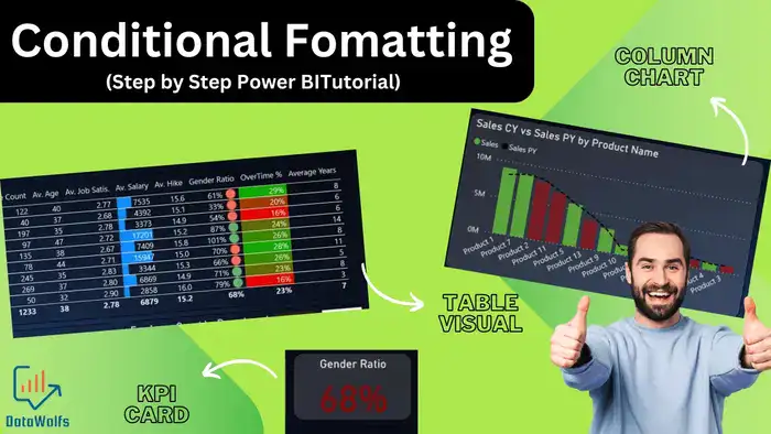
Applying conditional formatting in Power BI is a breeze. Let’s walk through how to do it for Power BI Tables or Matrix, Different Charts, and KPI Cards:
Conditional Formatting Table or Matrix in Power BI
- Select the table or matrix you want to format.
- Click the down arrow next to the field you want to format in the Values well of the Visualizations pane.
- Choose Conditional formatting.
- Select the type of formatting you want to apply (e.g., background color, font color, data bars).
- Select the Format Style and define the rules for applying the formatting. For example, you might highlight cells with values greater than a certain threshold with a green background.
- Click OK to apply the formatting.
Conditional Formatting Bar Chart or Columns Chart in Power BI
- Select the chart you want to format.
- Go to the Format pane for the chart.
- Click on the data series you want to format (e.g., bars).
- Under Colors, click the fx next to the color picker.
- Set the Format style to Rules and define your formatting conditions.
- Click OK to apply the formatting.
Conditional Formatting Bar Chart or Columns Chart in Power BI
- Select the KPI card you want to format.
- Go to the Format pane for the card.
- Expand the Data Label section.
- Click the three dots next to the Color option.
- Choose Conditional formatting.
- Define rules for formatting the data label color based on the KPI value.
- Click OK to apply the formatting.
Exploring Formatting Options
Power BI offers a variety of conditional formatting options:
- Background Color: Highlight cells or chart elements based on their values (e.g., green for positive values, red for negative values).
- Font Color: Emphasize important data points by changing the font color.
- Data Bars: Visually represent data values within a cell using color-coded bars.
- Icons: Use icons (e.g., smiley faces, arrows) to indicate performance or trends.
Choose Between Format Styles
In Power BI, conditional formatting offers several styles to enhance visualizations, including Gradient, Rules, and Field Values. Let’s delve into each style to understand how they can be utilized effectively:
- Gradient: Gradient formatting applies a smooth transition of colors across a range of values, allowing users to visually perceive variations in data intensity. This style is particularly useful for depicting data trends or distributions in a visually appealing manner. Here’s how it works:
- Usage: Gradient formatting is typically applied to numerical or continuous data where a gradual change in color signifies incremental changes in value.
- Application: Users can define a starting and ending color along with intermediate steps to create a gradient scale. For example, a gradient from green to red can be used to indicate low to high values respectively.
- Example: Suppose you have a sales report where higher sales values are represented in darker shades of green, while lower values are depicted in lighter shades. This gradient helps identify regions of high and low performance at a glance.
- Rules: Rule-based formatting allows users to specify conditions or thresholds for applying formatting styles to their data. This style offers flexibility in customizing formatting based on specific criteria, enabling users to highlight important data points effectively. Here’s an overview:
- Usage: Rules-based formatting is suitable for scenarios where discrete conditions need to be met to trigger formatting changes. This can include highlighting outliers, surpassing target values, or indicating specific data categories.
- Application: Users can define rules based on data values, such as greater than, less than, equal to, or between certain thresholds. Formatting styles, such as color changes, font styles, or icon sets, are applied based on these rules.
- Example: In a project management dashboard, tasks overdue by more than a week can be highlighted in red, while tasks due within the next three days can be highlighted in yellow. This rule-based formatting draws attention to critical tasks requiring immediate action.
- Field Values: Field value formatting allows users to apply formatting styles directly based on the values within a specific field or measure. This style provides a straightforward approach to formatting data without the need for complex rules or calculations. Here’s how it functions:
- Usage: Field value formatting is ideal for scenarios where formatting needs to be applied uniformly across all data points within a field or measure.
- Application: Users can specify formatting styles, such as background color, font color, or font size, directly based on the values within the chosen field or measure. This ensures consistent formatting across the entire dataset.
- Example: In a customer satisfaction survey analysis, positive feedback scores can be highlighted in green, neutral scores in yellow, and negative scores in red. Field value formatting helps categorize and visualize feedback effectively.
By leveraging these different format styles in Power BI conditional formatting, users can tailor their visualizations to effectively convey insights, trends, and outliers within their data, ultimately enhancing the clarity and impact of their reports.
Advanced Techniques
Conditional formatting goes beyond basic rules. You can explore features like:
- Color Scales: Create gradients where colors change smoothly based on data values.
- Thresholds: Define specific ranges for applying formatting (e.g., highlight only values exceeding a certain limit).
- Custom Formatting Rules: Craft complex rules based on calculations or other data fields.
Benefits and Best Practices
Conditional formatting unlocks a world of benefits
- Improved Data Interpretation: Visual cues make it easier to grasp data patterns and identify anomalies.
- Faster Identification of Trends and Outliers: Color highlights draw attention to important information.
- Visually Appealing Reports: Conditional formatting creates aesthetically pleasing and engaging reports.
Here are some best practices for effective use:
- Choose color schemes that are easy on the eye and relevant to your data (e.g., red for negative values, green for positive values).
- Avoid information overload. Don’t use too many formatting rules, as it can clutter your visuals.
- Ensure clarity for viewers. Make sure the formatting is intuitive and reinforces your data story.
Conclusion
Conditional formatting is a powerful tool that can elevate your Power BI visualizations to a whole new level. By using it strategically, you can transform your reports from basic data dumps into impactful communication tools. It turns raw data into a compelling narrative. Experiment with it, explore its depths and watch your data come alive.
So, experiment, explore the possibilities, and unleash the power of conditional formatting in your next Power BI project!
Bonus: Real-World Example
Have you tried using conditional formatting in Power BI? If not check our two real-world Power BI Projects where we have used conditional formatting. First Project: Power BI Tutorial for Beginners: HR Dashboard Project, Second Project: Power BI Sales Dashboard | Power BI End-to-End Project Tutorial 2023
Read more about conditional formatting from Microsoft.