Are you looking to learn Power BI and analytics skills with practical projects and tutorials? Do you want to create an HR analytics & attrition dashboard? If so, this beginner-friendly Power BI tutorial is for you!
In this blog post, we’ll guide you through the process of building a powerful HR attrition dashboard using Power BI, a powerful and popular tool for data visualization and business intelligence. This dashboard will empower you to analyze key HR KPIs like Employee Count, Salary, Gender Ratio, and attrition patterns, identify high-risk areas, and uncover the factors driving employee turnover.
You will also learn how to apply some of the best practices and techniques for dashboard design, such as choosing the right visualizations, filters, and metrics, and making the dashboard interactive, clear, and informative.
Here’s what we’ll cover in this end-to-end Power BI project:
- Step 1: Understanding Business Requirement
- Step 2: Import and explore the HR data set
- Step 3: Create a data model and relationships
- Step 4: Define the key performance indicators (KPIs) and DAX measures
- Step 5: Design the dashboard layout and visualizations
- Step 6: Add interactivity and functionality to the dashboard
- Step 7: Publish and share the dashboard
- Step 8: Drawing Insights from the Dashboard
If you are ready to start this exciting and rewarding project, let’s dive in!
The Objective of the HR Dashboard | Business Problem |Business Requirement
Before diving into data, it’s crucial to align with your organization’s HR goals. Identify the specific questions your dashboard aims to answer. What insights are HR professionals seeking to understand employee attrition?
- Composition of the Workforce: Understand the composition of the workforce by department, education field, business travel frequency, gender, job role, and age group.
- HR KPIs: Analyze employee count, average salary, average monthly salary, average age, average salary hike, average Job satisfaction score, and gender ratio.
- Identify trends and patterns in employee data across different parameters like Education, Age group, and Department.
- Analyze different HR KPIs for different Job roles.
- Show the impact of Age & Department on Salary.
- Employee Attrition Analysis: Identify the factors that influence employee turnover and retention, such as salary, age, gender, education, and employee demographics (e.g., age, marital status, work-life balance).
- Gain insights into areas with high attrition rates to inform targeted retention strategies.
- Analyze the attrition rate by various parameters including business travel, job satisfaction, marital status, work-life balance, monthly income, and age.
- Compare the attrition rates in different departments such as Sales, R&D, and HR.
Download Power BI Desktop Free Microsoft
Import and explore the HR data set
The next step is to import and explore the HR data set that we are going to use for our dashboard. The HR data set is a CSV file that contains information about 1470 employees, such as their age, gender, department, job role, salary, education, performance, satisfaction, attrition, etc. The data set is available online and you can download it from this link: HR data set.
To import the data set into Power BI, we need to follow these steps:
- Open Power BI Desktop and click on Get data in the ribbon.
- Select Text/CSV from the list of data sources and browse to the location of the CSV file.
- Click on Load to load the data into Power BI.
After importing the data set, we need to explore and understand the data. We can use the Data view and the Model view in Power BI to examine the data. We can also use the Power Query Editor to perform any data cleaning, transformation, or validation that we need.
Here are some of the things that we can do to explore and understand the data:
- Check the number of rows and columns in the data set and their names and data types.
- Check the range, mean, median, mode, standard deviation, and distribution of the numerical variables, such as age, salary, satisfaction, etc.
- Check the frequency, percentage, and proportion of the categorical variables, such as gender, department, job role, attrition, etc.
- Check for any missing, invalid, or inconsistent values in the data set and handle them appropriately.
- Check for any outliers or anomalies in the data set and decide whether to keep them or remove them.
- Check for any correlations or relationships between the variables and visualize them using charts or graphs.
Create a Data Model and Relationships
The third step is to create a data model and relationships in Power BI. A data model and relationships are essential for creating a dashboard that can display accurate and meaningful information. A data model and relationships define how the data is organized and calculated, and how the tables are connected to each other.
To create a data model and relationships in Power BI, we need to use the Model view and the Relationships view. The Model view shows the tables, columns, and measures that we have in our data set. The Relationships view shows the connections between the tables and how they are related to each other.
In our case, we have only one table in our data set, which is the HR data set. Therefore, we do not need to create any relationships between tables. However, if we had multiple tables in our data set, we would need to create relationships between them based on the common columns that they share. For example, if we had a separate table for department information, we would need to create a relationship between the HR data table and the department table based on the department column.
To create a relationship between two tables, we need to follow these steps:
- Drag and drop the common column from one table to the matching column in the other table in the Relationships view.
- A line will appear between the two tables indicating the relationship. Click on the line to see the relationship properties.
- Choose the appropriate granularity, cardinality, and direction for the relationship. The granularity refers to the level of detail of the data, the cardinality refers to the number of rows in each table that are related to each other, and the direction refers to the flow of information between the tables.
- Click on OK to save the relationship.
Define the key performance indicators (KPIs) and DAX measures
The third step is to define the key performance indicators (KPIs) and DAX measures in Power BI. KPIs and DAX measures are the core elements that drive the dashboard and display the data in a meaningful and actionable way. KPIs and DAX measures should be relevant, accurate, and simple, and should match the business requirement and the audience’s needs and expectations.
To define the KPIs and DAX measures in Power BI, we need to use the Modeling tab and the DAX language. The Modeling tab is where we can create and manage the KPIs and DAX measures in our data model. The DAX language is the formula language that we use to define the logic and calculation of the KPIs and DAX measures.
Here are some of the things that we can do to define the KPIs and DAX measures:
- Create a KPI based on an existing measure by selecting the measure in the Fields pane, and clicking on the New KPI button in the Modeling tab. A KPI dialog box will appear, where we can specify the goal, the status, and the trend of the KPI. We can also change the format and style of the KPI, such as the display units, the decimal places, the text formatting, etc.
- Create a DAX measure by clicking on the New Measure button in the Modeling tab. A formula bar will appear, where we can enter the name and the DAX formula of the measure. We can use various DAX functions, operators, and column references to define the calculation of the measure. We can also change the format and style of the measure, such as the data type, the display units, the decimal places, the text formatting, etc.
- Edit or delete a KPI or a DAX measure by selecting the KPI or the measure in the Fields pane, and clicking on the Edit or Delete button in the Modeling tab. We can also edit or delete a KPI or a DAX measure by right-clicking on the KPI or the measure in the Fields pane, and selecting the Edit or Delete option from the menu.
DAX Measures for HR Dashboard (Power BI Tutorial for Beginners):
//Measure to Calculate Attrition Count
Attrition Count = CALCULATE([Employee Count], HR_Analytics[Attrition]="Yes")
//Measures to Calculate Attrition Rate
DIVIDE ([Attrition Count],CALCULATE ( [Employee Count], ALL ( HR_Analytics[Attrition] ) ),0)Learn More About Calculate & Divide DAX Power BI Functions.
//Measures for attrition Target
Attrition Target = 0.2

//Measures to calculate Average Age
Average Age = AVERAGE(HR_Analytics[Age])

//Measures to calculate Average Job Satisfaction
Average Job Satisfaction = AVERAGE(HR_Analytics[JobSatisfaction])

//Measures to calculate Average Monthly Salary
Average Salary = [Monthly Salary]/[Employee Count]

//Measures to calculate Average Salary Hike
Average Salary Hike = AVERAGE(HR_Analytics[PercentSalaryHike])

//Measures to calculate Average Yaers at Company
Average Years = AVERAGE(HR_Analytics[YearsAtCompany])

//Measures to calculate Employee Count
Employee Count = DISTINCTCOUNT(HR_Analytics[EmpID])

//Measures to calculate Gender Ratio

Gender Ratio =
DIVIDE (
    CALCULATE ( [Employee Count], HR_Analytics[Gender] = "Female" ),
    CALCULATE ( [Employee Count], HR_Analytics[Gender] = "Male" ),
    0
)

//Measures to calculate Monthly Salary
Monthly Salary = SUM(HR_Analytics[MonthlyIncome])
Design the dashboard layout and visualizations
The fourth step is to design the dashboard layout and visualizations in Power BI. A dashboard layout and visualizations are the visual elements that make up the dashboard and display the data attractively and understandably. A dashboard layout and visualizations should be simple, clear, and informative, and should match the business requirement and the audience’s needs and expectations.
To design the dashboard layout and visualizations in Power BI, we need to use the Report view and the Visualizations pane. The Report view is where we can arrange and customize the visual elements on the dashboard, such as the title, the filters, the charts, the tables, etc. The Visualizations pane is where we can choose and modify the visualizations for our data, such as the type, the format, the style, the interactivity, and the functionality.
Here are some of the things that we can do to design the dashboard layout and visualizations:
- Add a title to the dashboard that summarizes the main topic and purpose of the dashboard, such as “HR Analytics Attrition Dashboard”.
- Add filters to the dashboard that allow the users to filter the data by different parameters, such as department, education field, business travel, gender, job role, or age group. To add a filter, we need to drag and drop the field that we want to filter by from the Fields pane to the Filter well in the Visualizations pane. We can also change the format and style of the filter, such as the orientation, the selection controls, the font, the color, etc.
- Add charts to the dashboard that visualize the data and show the key performance indicators (KPIs) and measures that we defined in the previous step, such as the attrition count, the attrition rate, the monthly salary, the average age, etc. To add a chart, we need to select the type of chart that we want from the Visualizations pane, and drag and drop the fields that we want to visualize from the Fields pane to the appropriate wells in the Visualizations pane, such as the axis, the legend, the value, etc. We can also change the format and style of the chart, such as the title, the labels, the colors, the legend, etc.
- Add tables to the dashboard that display the detailed data and show the breakdown of the data by different categories, such as the job role, the employee count, the attrition rate, the average years in the company, the average hourly rate, etc. To add a table, we need to select the Table icon from the Visualizations pane, and drag and drop the fields that we want to display from the Fields pane to the Values well in the Visualizations pane. We can also change the format and style of the table, such as the font, the color, the sorting, the filtering, etc.
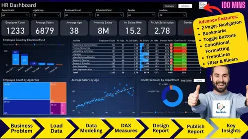
HR Dashboard Overview – Power BI Template
- Create Report Background in PowerPoint
- Create Slicers – Department, Education Field, Business Travel, Gender, Job Role, Age Group.
- Create KPI cards – Employee Count, Average Salary, Monthly Salary, Average Age, Average Salary Hike, Average Job Satisfaction Score, Gender Ration
- Create Visuals:
- Employee Count by EducationField and Department
- Table Explaining different KPIs with respect to Job Role
- Employee Count by AgeGroup
- Average Salary and Employee Count by Age
- Monthly Salary by Department
HR Attrition Analysis – Power BI Template
- Create Report Background in PowerPoint
- Create Slicers – Department, Education Field, Business Travel, Gender, Job Role, Age Group.
- Create KPI cards -Attrition Count, Attrition Rate, Average Salary, Average Age
- Create Gauge Charts – Attrition rate of Departments (Sales, R&D, and HR)
- Create Visuals
- Attrition Rate by BusinessTravel
- Attrition Rate by JobSatisfaction
- Attrition Rate by WorkLifeBalance
- Attrition Rate by MonthlyIncome
- Attrition Rate by Age
- Attrition Rate by Job Roles
Add Interactivity and Functionality to the dashboard
The fifth step is to add interactivity and functionality to the dashboard in Power BI. Interactivity and functionality are the features that make the dashboard more user-friendly and dynamic and allow the users to explore and manipulate the data according to their needs and preferences.
To add interactivity and functionality to the dashboard in Power BI, we need to use the Visualizations pane and the Fields pane. The Visualizations pane is where we can choose and modify the visualizations for our data, such as the type, the format, the style, the interactivity, and the functionality. The Fields pane is where we can drag and drop the fields from our data model to the visualizations, and define the roles and values of the fields, such as the axis, the legend, the value, the filter, etc.
Here are some of the tools and techniques that we can use to add interactivity and functionality to the dashboard:
- Slicer: A slicer is a visualization that allows the users to filter the data by selecting one or more values from a list. We can use a slicer to filter the data by department, education field, business travel, gender, job role, or age group. To add a slicer to the dashboard, we need to select the Slicer icon from the Visualizations pane, and drag and drop the field that we want to filter by from the Fields pane to the Field well in the Visualizations pane. We can also change the format and style of the slicer, such as the orientation, the selection controls, the font, the color, etc.
- Button: A button is a visualization that allows the users to perform an action by clicking on it, such as navigating to another page, opening a bookmark, or resetting the filters. We can use a button to create a menu or a navigation bar for the dashboard. To add a button to the dashboard, we need to select the Button icon from the Visualizations pane, and drag and resize the button on the dashboard. We can also change the format and style of the button, such as the type, the text, the icon, the font, the color, etc. We also need to assign an action to the button, such as the destination page, the bookmark, or the reset option.
- Bookmark: A bookmark is a feature that allows us to save the current state of the dashboard, such as the filters, the selections, the visuals, etc. We can use a bookmark to create different scenarios or views of the dashboard, and link them to the buttons. To create a bookmark, we need to go to the View tab in the ribbon, and select the Bookmarks pane. We can then click on the Add icon to create a new bookmark, and give it a name. We can also update or delete the bookmarks as needed.
- Selection: A selection is a feature that allows us to highlight or filter the data by clicking on a visual element, such as a bar, a slice, or a point. We can use a selection to drill down or cross-filter the data, and see the details or the relationships of the data. To enable or disable the selection, we need to go to the Format tab in the Visualizations pane, and select the Edit interactions icon. We can then choose the type of interaction that we want for each visual element, such as Highlight, Filter, or None.
- Bookmark Navigation: Bookmark navigation is a feature that allows you to create bookmarks for different states of your dashboard, such as the filters, the selections, the visuals, etc. You can then link the bookmarks to buttons or other visuals, and use them to navigate between the different states of your dashboard
- Page navigation: Page navigation is a feature that allows you to create multiple pages for your dashboard, and link them to buttons or other visuals, and use them to navigate between the different pages of your dashboard.
We have used Slicers in the report to Slice or Filter Reports based on various parameters. And used Button, Bookmark, and Selection to toggle two visuals (Monthly Salary by Department and Employee Count by Department) with one another.
Publish and share the dashboard
The sixth and final step is to publish and share the dashboard in Power BI. Publishing and sharing the dashboard are the steps that allow you to make your dashboard accessible and visible to your intended audience, such as your colleagues, clients, or stakeholders. By publishing and sharing the dashboard, you can also get feedback, suggestions, and questions from your audience, and improve your dashboard accordingly.
To publish the dashboard in Power BI, we need to follow these steps:
- Click on the Publish button in the ribbon.
- Choose the destination workspace where you want to publish the dashboard. A workspace is a shared environment where you can collaborate with others on your dashboards and reports. You can either use your personal workspace or create a new workspace for your project.
- Click on Select to publish the dashboard to the selected workspace. A confirmation message will appear with a link to the dashboard online.
- Click on the link to open the dashboard in the Power BI service, which is the online version of Power BI.
To share the dashboard in Power BI, we need to follow these steps:
- Click on the Share button in the upper right corner of the dashboard.
- Enter the email addresses of the people or groups that you want to share the dashboard with. You can also add a message or a subject to the invitation.
- Choose the access level that you want to grant to the recipients. You can either allow them to view the dashboard only, or to view and edit the dashboard. You can also allow them to reshare the dashboard with others or not.
- Click on Share to send the invitation. The recipients will receive an email with a link to the dashboard.
Drawing Insights from the Dashboard
- The employee attrition rate is 16%, which is higher than the industry average of 12%. The main reasons for attrition are low salaries, high workload, and lack of career growth opportunities.
- The employee diversity and inclusion analysis reveals that there is a significant gap in gender representation, especially in HR, where only 33% are female. The education field is also dominated by Life Sciences & Medical, which accounts for more than 50% of the employees.
- The total employee count is 1233 with an average salary of $6,879 and a monthly total payroll of $8.5M.
- The majority of employees are in the age group of 26-35 (490) and 36-45 (425).
- Sales Executives are the largest job role (269), followed by Research Scientists (245).
- The highest average salaries are drawn by Managers ($17,201) and Research Directors ($15,947).
- Gender ratio is skewed towards one gender at 68%.
- The total attrition count is 237 with an overall attrition rate of 16%.
- Attrition rates vary across departments, with Sales (21%), R&D (19%), and HR (14%) having the highest rates.
- Among job roles, Sales Representatives (40%), Laboratory Technicians (24%), and Human Resources Specialists (23%) have the highest attrition rates.
- Employees who travel frequently for business have a higher attrition rate (25%) compared to those who rarely travel (8%).
- Employees who are dissatisfied with their jobs have a higher attrition rate (23%) compared to those who are satisfied (11%).
- The average age of employees facing attrition is 34.
- Attrition rates vary significantly based on job satisfaction levels; employees with lower job satisfaction have higher attrition rates.
- Single employees face a higher rate of attrition compared to married or divorced employees.
Download Power BI Project PBIX File (Power Bi Tutorial For Beginners)
Before you Download we also request you to visit our Power BI Sales Dashboard | Power BI End-to-End Project Tutorial. You can download all the resources including the Excel dataset, Background, Images & PBIX File.